As a designer, I often create digital experiences for clients...
But when it comes to showcasing myself, the challenge feels different:
- How do I make a site that represents me as a person?
- How do I balance between portfolio clarity and personal branding?
- And most importantly, how do I make people feel my character through design?
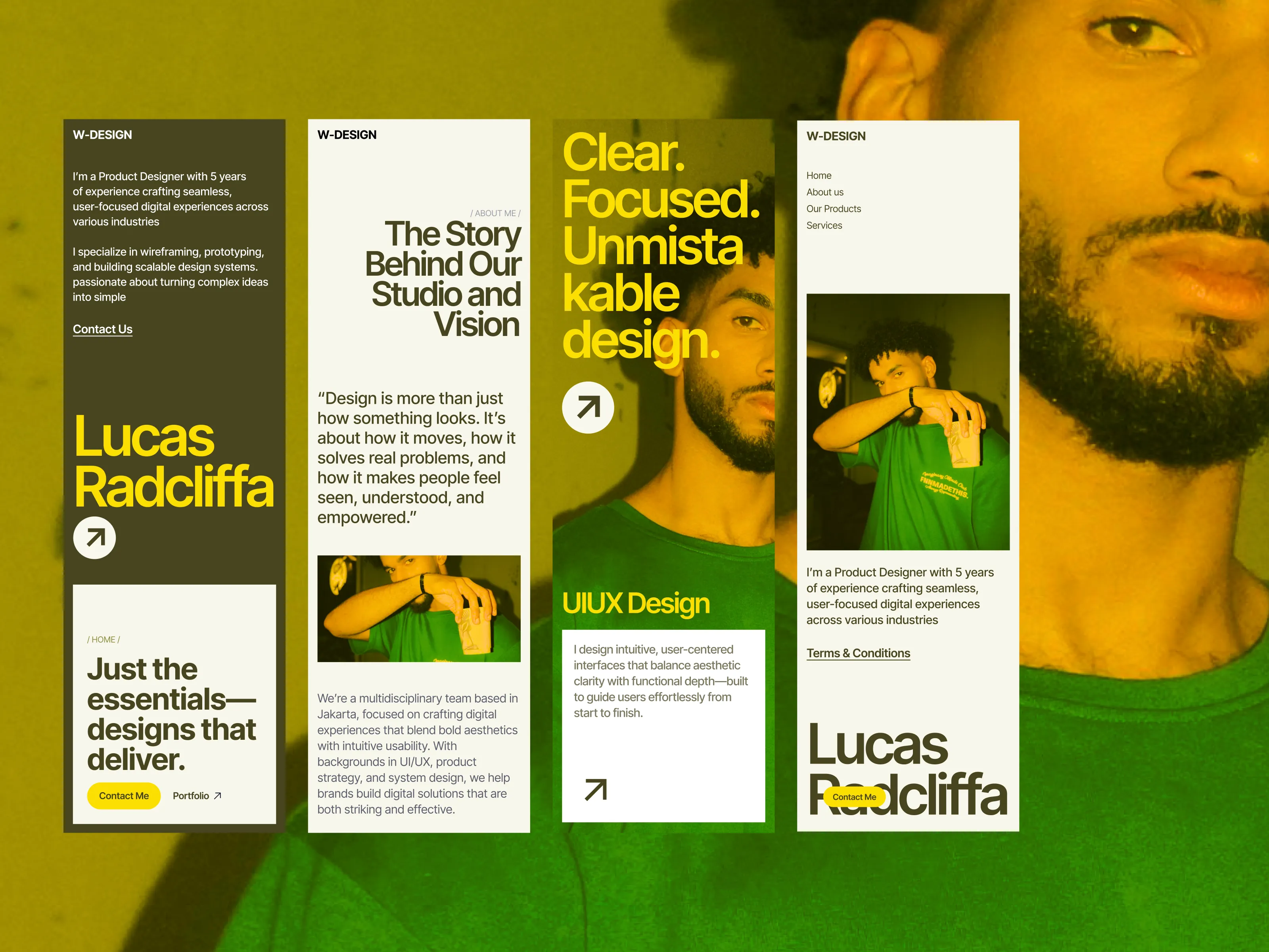
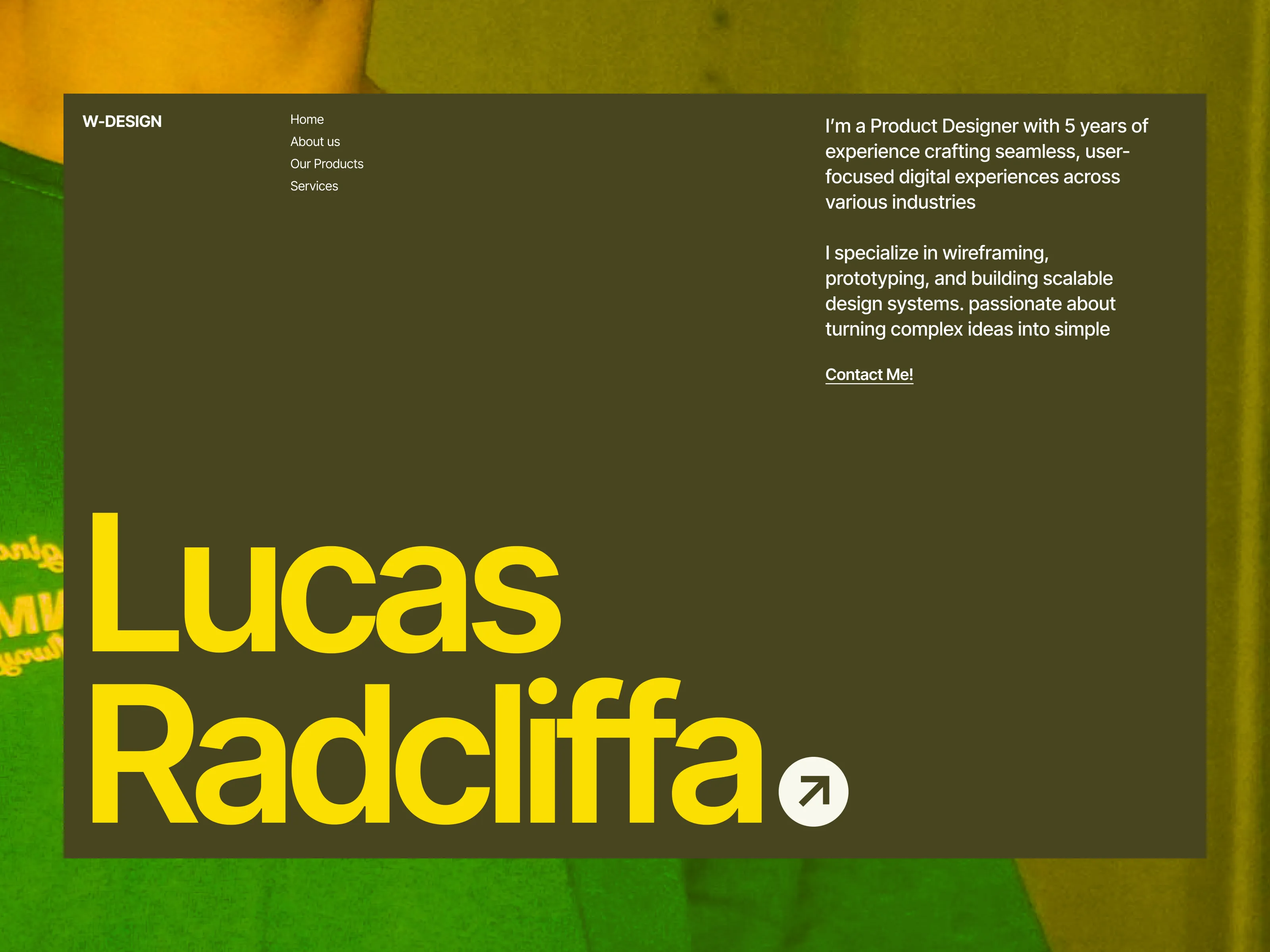
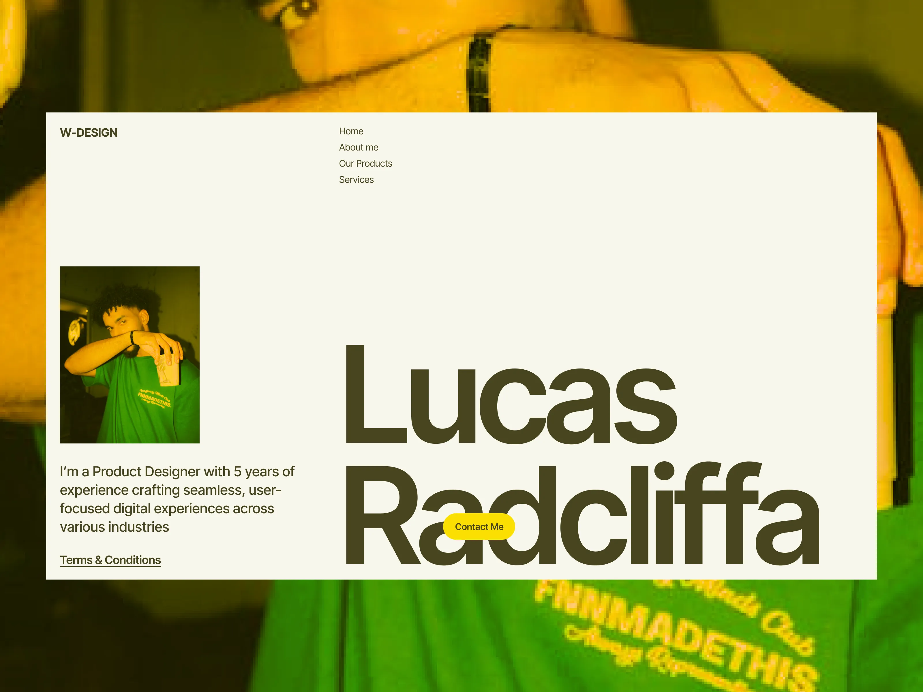
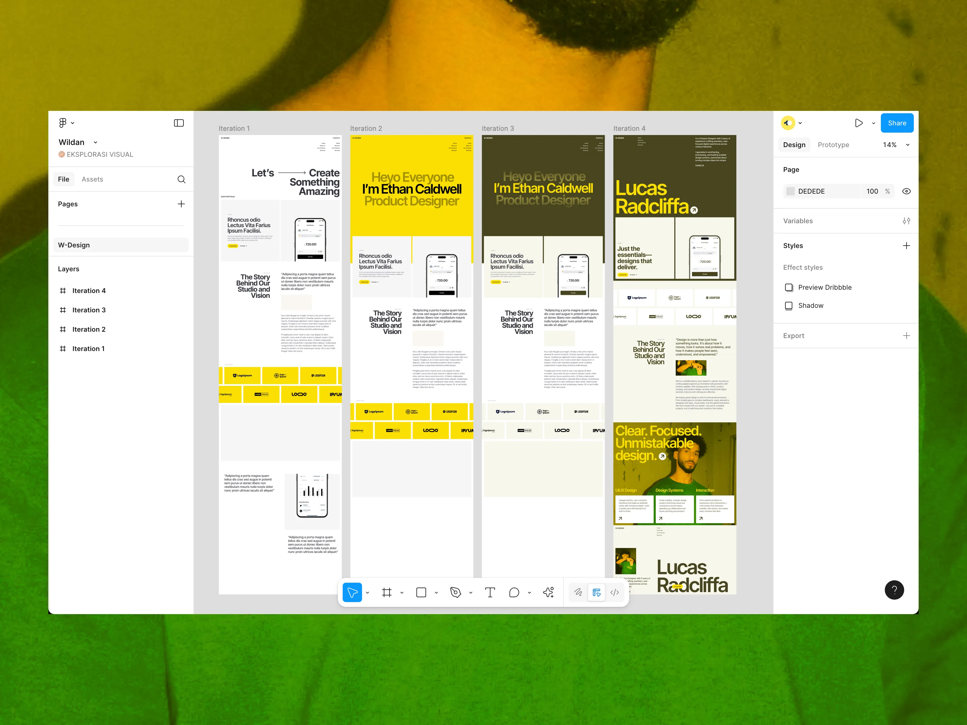
This exploration started with one strong visual: a portrait of me, used not just as an image, but as the anchor of identity.
Instead of a standard portfolio...
I designed it as a conversation with the visitor — direct, bold, and confident. The typography shouts my name unapologetically, while high-contrast colors inspired by editorial posters give it striking energy. The whole site flows like a magazine cover you scroll through, with each section unfolding like a feature spread.


I started with rough moodboard in Figma, pulling references from modern editorial layouts and music poster graphics.
I explored 3 different directions before choosing the one that felt most authentic — a balance of boldness and readability.
What do I stand for as a designer? And the answer became part of the design itself.
.webp)
.webp)
%20Case%20Story%20-%20Showcase%201.webp)