All of Chatify’s designs started with the mobile app interface. From there, I wanted to try something different — a fresh look and an AI feature that reminds users of old messages they haven’t replied to.
That idea turned into the main highlight of this series. And now, I’ll show you how I made it and the things hidden behind the Chatify App design ✨

🔍 Starting the Exploration
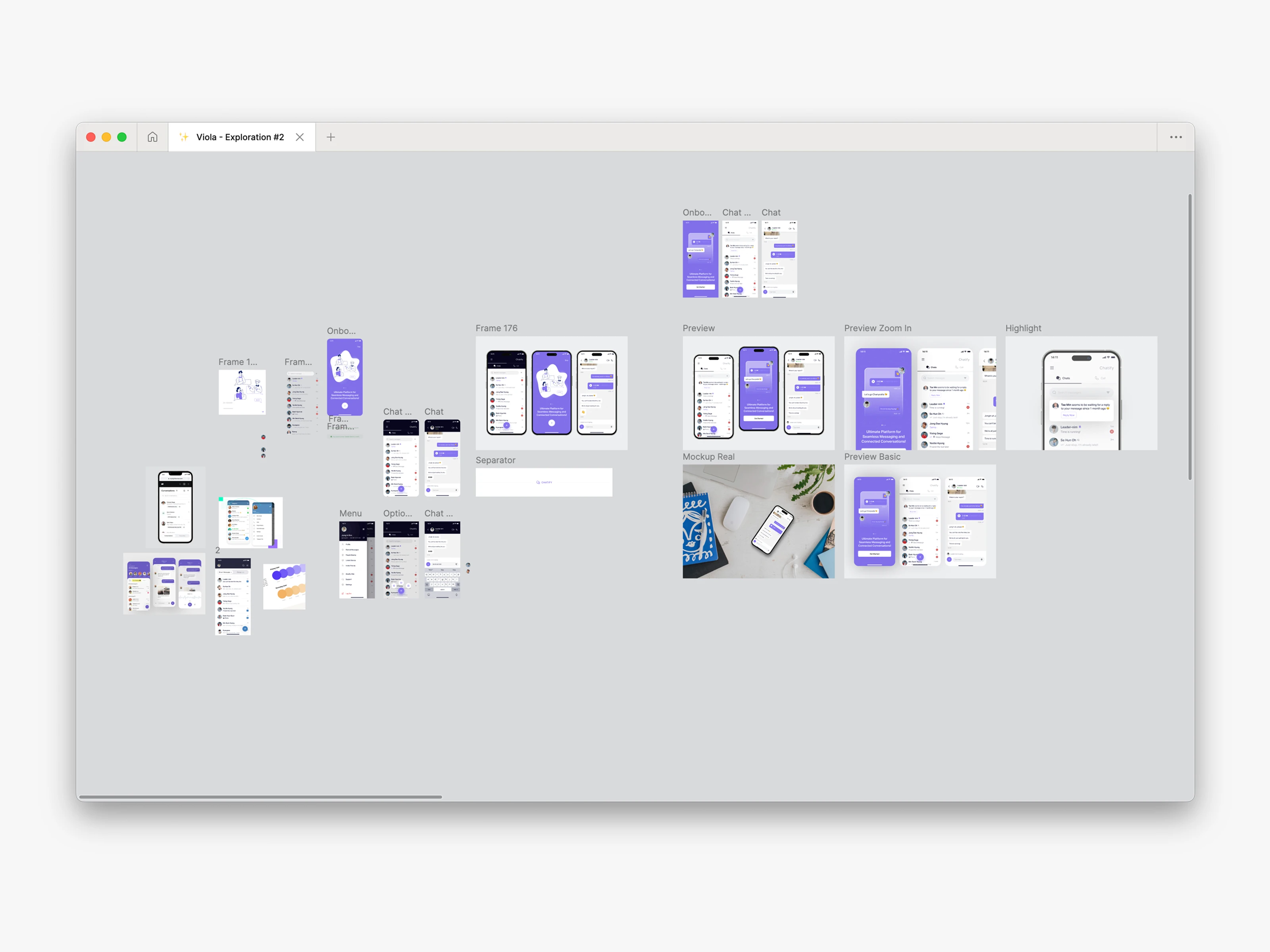
I started this exploration out of curiosity, without a strict brief or heavy research. Just me, my canvas, and an urge to see how far I could push the visual direction.
I just wanted to play with colors, layouts, and see what worked. The first versions used a lot of dark tones for the header. But after some testing, I felt it looked too common and did not really show anything new.
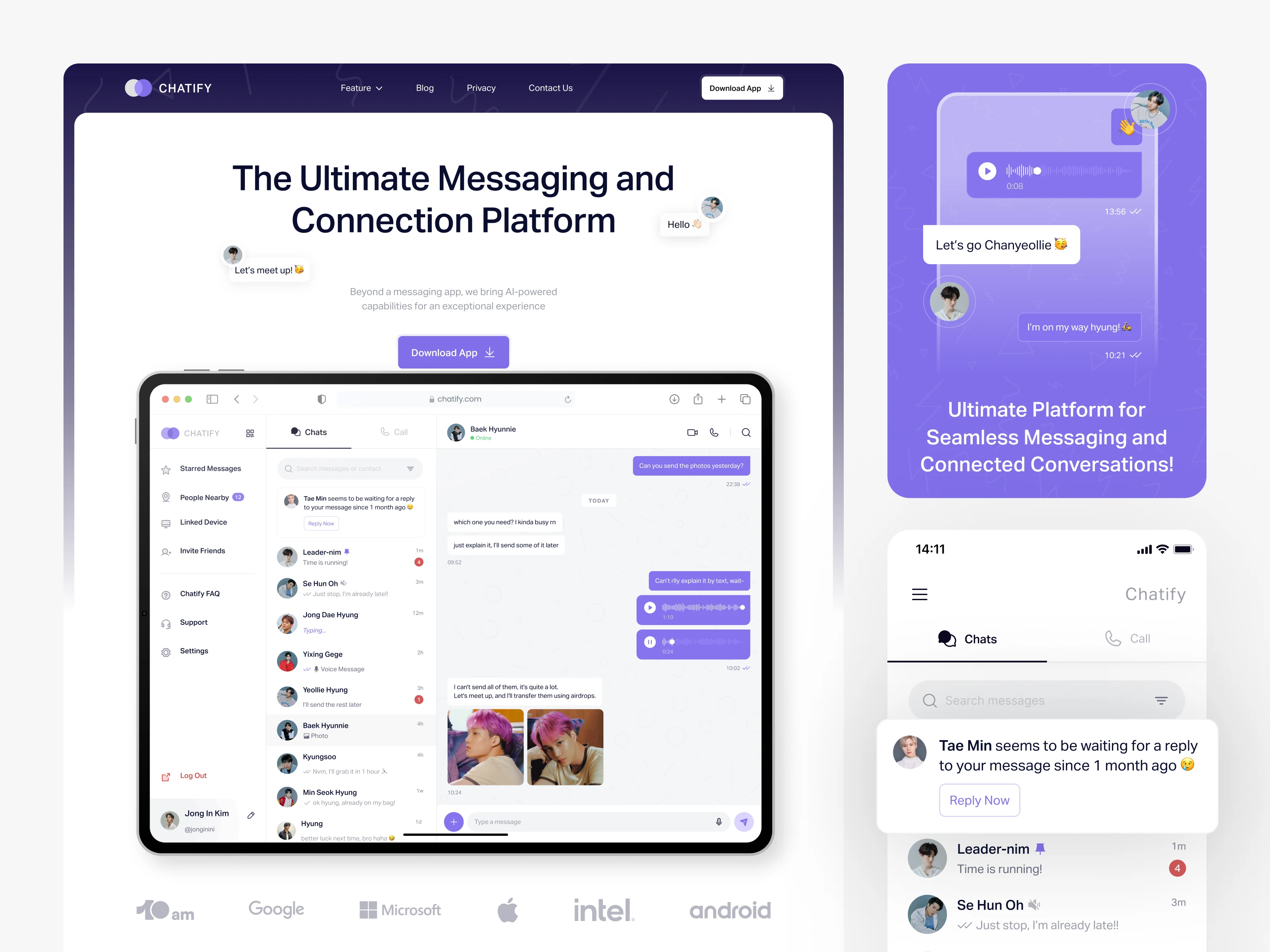
So I started to explore other directions. That was the moment I tried purple and white, which made the interface look more clean and modern.
At the same time, Wildan — the founder of 10am — shared an interesting idea.
“I was thinking about how there could be a feature to remind users if there are messages that haven’t been replied to for a month.”
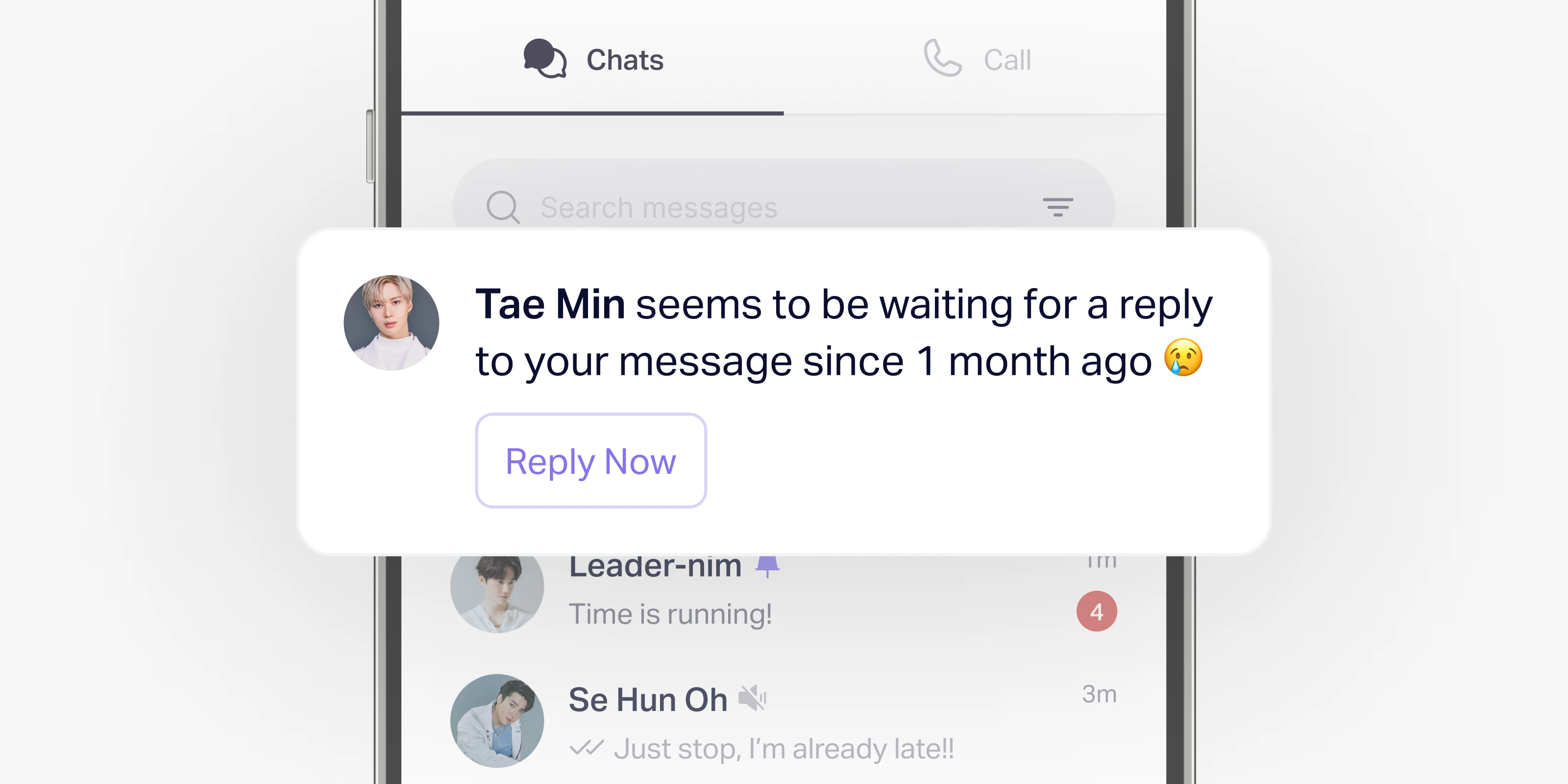
This sounded simple, but very useful. I thought it could give Chatify something unique compared to other apps. So I made this AI reminder feature the main highlight of the exploration.
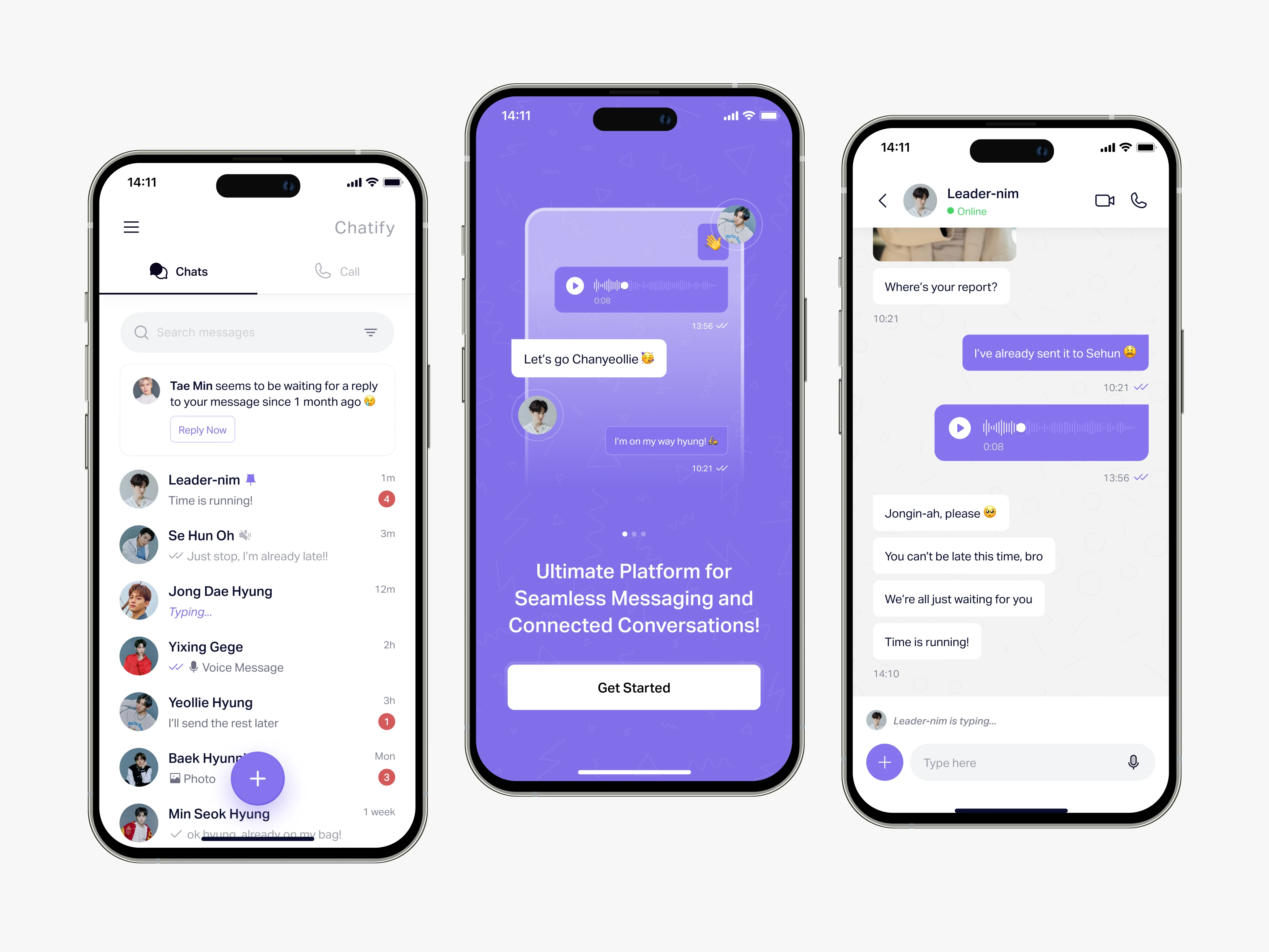
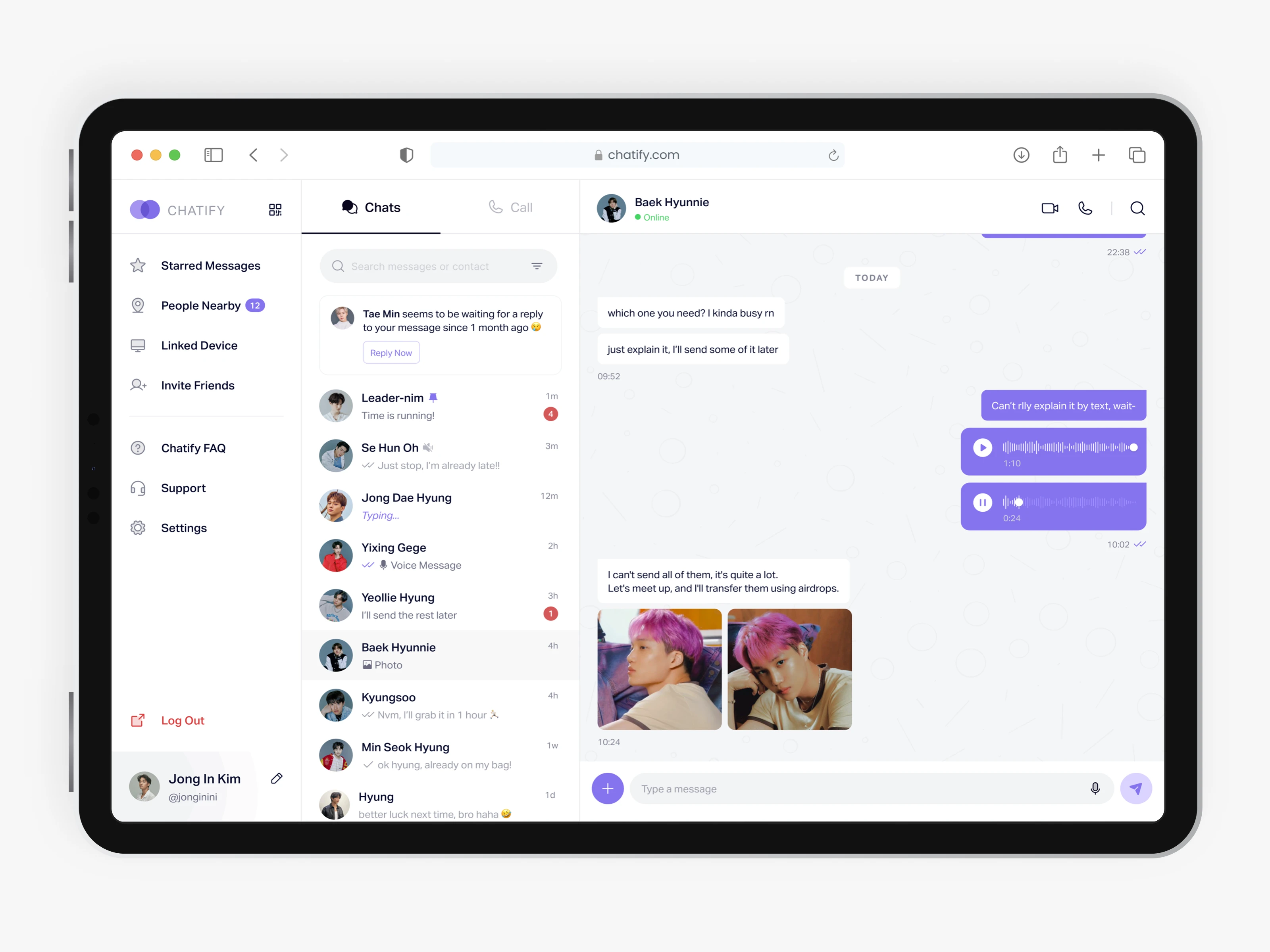
📱First Execution: Mobile App
The first execution focused on the mobile app. I made many trials, moving elements here and there, trying different placements for the chat list, icons, and notifications. I also pick a color guide I found to keep everything consistent.
During this stage, I also added some personal touches. For fun, I used names and photos from my favorite K-Pop group, EXO, inside the mockups. It was like a small easter egg that made the work more personal and enjoyable for me 😄
🖥️ Second Execution: Desktop Dashboard
After finishing the mobile version, I continued with a desktop dashboard. The goal was to see how the design could scale for bigger screens. I wanted to make sure the design felt flexible — not only for phones, but also for tablets and PCs.

Working on the dashboard helped me think more about layouts, spacing, and how information could be shown clearly when there is more screen space. This step made Chatify look more complete as a product.
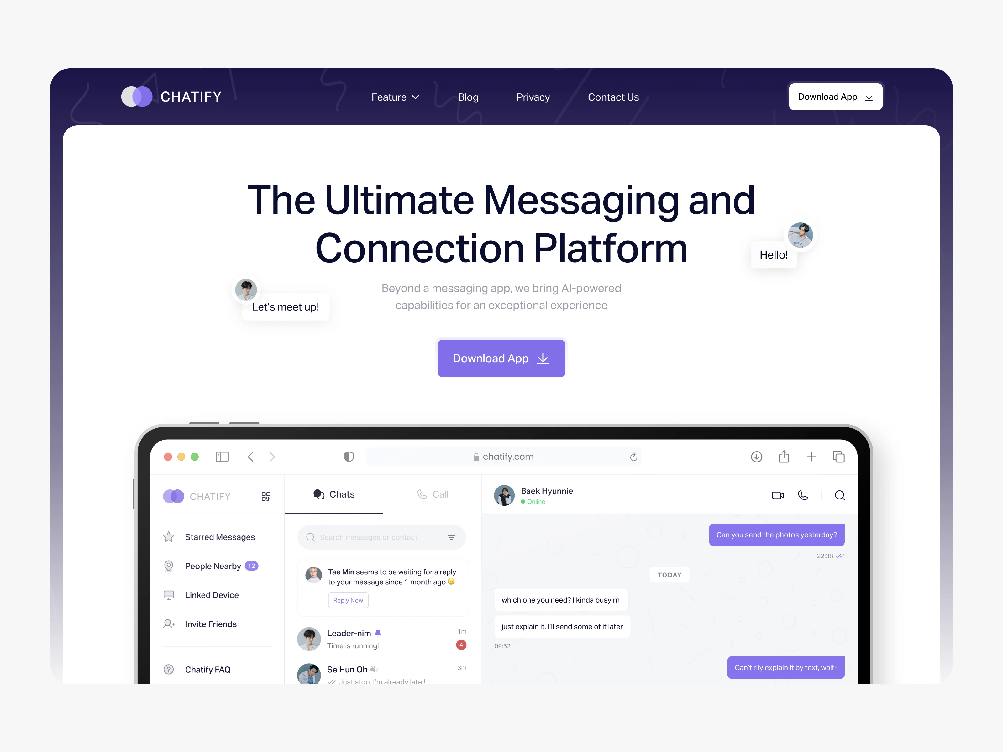
💻 Landing Page Preview
Here is the preview of the landing page that I made for Chatify. The video shows how the page looks when scrolling, and it is only to promote the design for the mobile app and the desktop app.
It’s a simple way to see the full layout in action.

And that’s the full story behind my Chatify design exploration! 🎉
If you made it this far, thank you so much for sticking around and reading until the end. It really means a lot. I had fun creating this, and I hope you had just as much fun scrolling through it. See you on the next case story! 👋
.webp)
.webp)
%20Case%20Story%20-%20Showcase%201.webp)